
Contrast as a Design Tool: Old, New, Textured, Smooth
A well-designed space isn’t about perfection—it’s about balance. And one of the most effective ways to achieve that balance? Contrast. It's the design equivalent of a great conversation: unexpected pairings, a little tension, and a lot of personality.

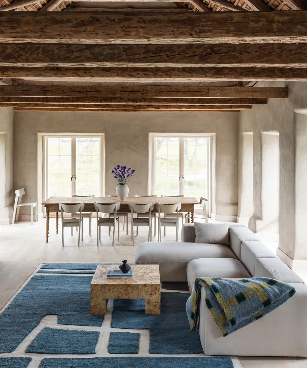
image credit: Brian Paquette
Old Meets New
Blending eras adds depth. A vintage cabinet beside a modern light fixture doesn’t feel mismatched—it feels intentional. The old brings warmth and story; the new adds clarity and function. Together, they tell a richer story than either could alone.
Want to make a room feel curated instead of cookie-cutter? Bring in something with patina. Even just one piece—a well-loved table, an antique rug—can shift the whole feel of a space.

imagre credit: Layered
Textured Meets Smooth
Contrast also comes alive through materials. Rough linen against glossy tile. A weathered wood beam above sleek stainless steel. Woven baskets beside polished stone. These pairings add visual interest and dimension.
Texture invites you in; smoothness lets your eye rest. Too much of either and things feel either chaotic or cold. But together? They balance each other beautifully.
image credit: Victoria Maria
The Takeaway
Contrast isn’t about clashing—it’s about complementing. A little tension between old and new, textured and smooth, creates rooms that feel layered, lived-in, and undeniably interesting.
-Juliette