
Why Every Room Needs a Little Ugly
...and why perfection is the enemy of personality
Let me start with a confession: I own a ceramic duck. Not a sleek, minimalist, Jonathan Adler kind of duck. No. Mine is more “Great Aunt Mildred's Florida condo circa 1986” meets “found it at a garage sale for $3 and felt spiritually called.” It is objectively hideous. And it’s the best thing in my kitchen right now.
Welcome to the design hill I’m willing to die on:
Every well-designed space needs something a little bit ugly.
 Hear me out.
Design has become so curated, so algorithm-friendly, so beige and boucle and “I saw it on Pinterest,” that a lot of homes are starting to look like they were ordered off a mood board and assembled by AI.
And while symmetry, cohesion, and balance all have their place, a room that’s too perfect starts to feel sterile. Like a dentist’s waiting room—but make it Restoration Hardware.
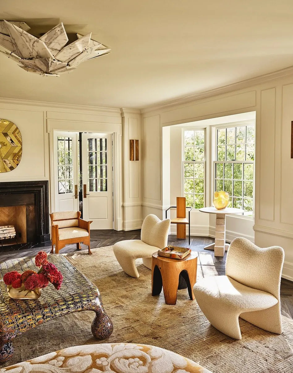
Enter: the wild card. The ugly vase. The creepy portrait. The oddball lamp that looks like it might come to life at night and whisper tax advice. These are the pieces that make a room human. They say: Someone lives here. Someone weird. Someone interesting. Maybe someone with a story.

image credit: Brooke Giannetti
The Psychology of “Off”
From a design psychology standpoint (yes, it’s a thing), our brains are wired to crave a bit of friction. In music, it’s called dissonance. In fashion, it’s that “ugly-chic” shoe trend that won’t die. And in interiors, it’s the art of contrast—the moment where something shouldn’t work, but gloriously does.
That jarring element makes the rest of the room pop. It adds tension, movement, life. It’s the spice in your otherwise perfectly simmered soup.
Iconic Examples of Ugly Done Right

Elsie de Wolfe, one of the OGs of interior design, often tossed in bizarre objects she loved “just because.” (Her words, not mine.)
Nate Berkus has a grotesque hand sculpture in his home and defends it like it's his firstborn.
The entire set of Fleabag is a masterclass in chaotic-but-beautiful design. (RIP guinea pig café.)
And if you’ve ever toured the home of someone truly stylish, you’ll notice: it’s not flawless. It’s layered. It’s collected. It’s got a taxidermy squirrel holding a martini or a painting that looks like it was made during a séance.

image credit: Kelly Wearstler
The “Little Ugly” Rules
If you’re new to this, don’t panic. Here’s how to start:
Thrift with feeling, not logic.
If something makes you laugh or recoil or feel unexpectedly tender—buy it. That’s the piece.
Use it as a palette-breaker.
Got a room full of warm tones? Throw in something cool and rusty. Too modern? Toss in something Victorian and vaguely haunted.
Let your guests question you.
If at least one person walks into your home and says “...huh,” you're doing it right.

Final Word: Pretty Is Easy. Personality Takes Guts.
Ugly is not the enemy of beauty. It’s the secret ingredient. The pinch of salt in the cookie. The scar that tells the story. The thing that makes your space yours.
So go ahead—put the weird frog ashtray on the mantle. Frame your kid’s deranged macaroni art like it’s a Warhol. Let your house be a little bit wrong.
It might just be the most right it’s ever looked.
-Juliette