
Why “Color Capping” Is Your Next Interior Power Move
If you haven’t yet heard the phrase “color capping”, consider yourself not quite in the club yet. It’s 2025’s boldest paint trick.
Here’s how to ride the wave (without turning your living room into a clown car).

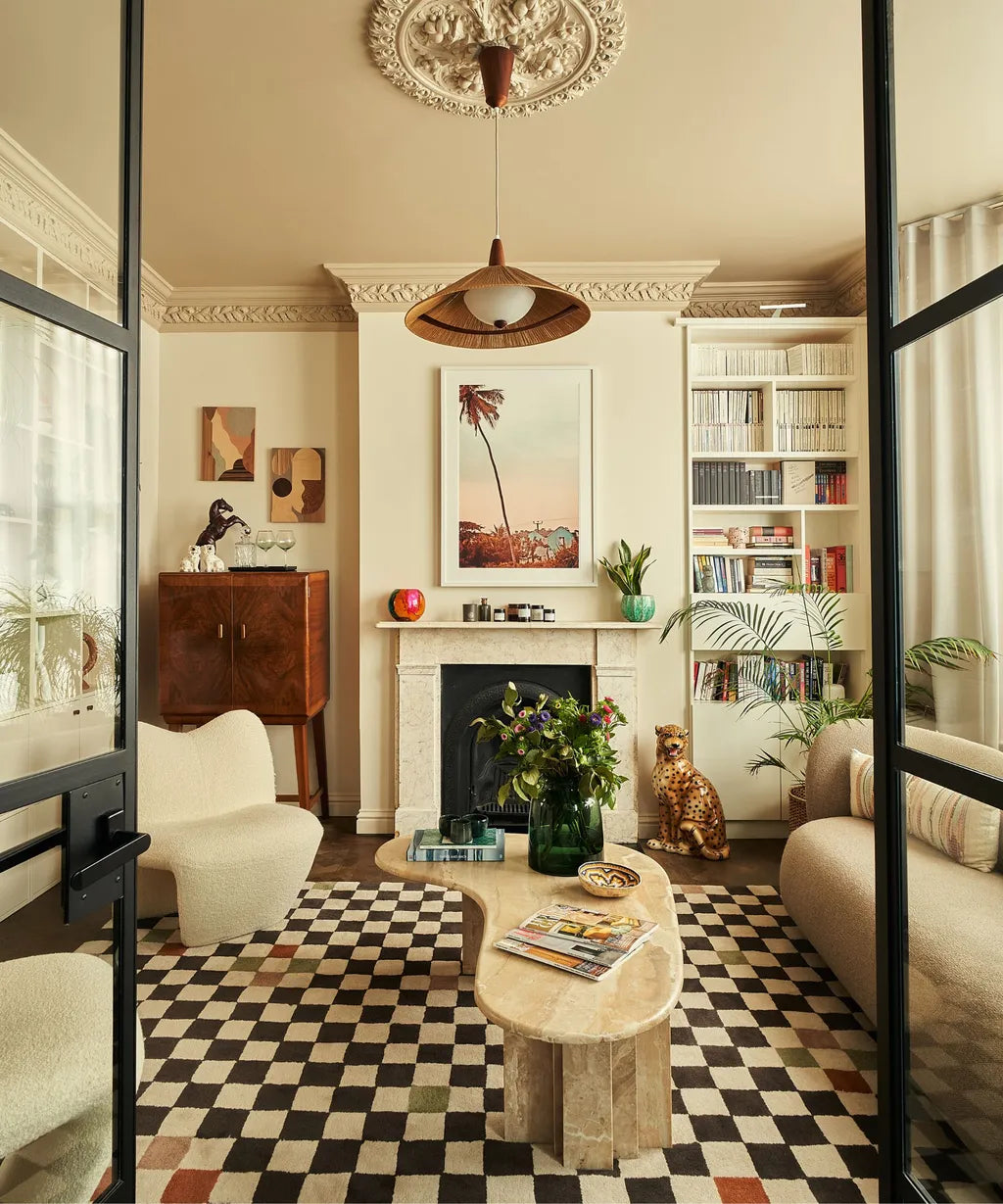
image credit: Lone Fox for Loloi
What is Color Capping (and Why You Should Care)
“Color capping” refers to painting a room in a gradient of the same hue —lightest at the base, darkening toward the ceiling — so the eye naturally travels upward, elongating the room.
In the reverse version, the base of the wall is richer, and it fades upward into lighter tones. That subtle flip creates a grounded, glowing effect that feels modern, warm, and surprisingly forgiving to real-world lighting. But we'll touch on that another time.

Why It’s Trending Right Now
Mood meets drama: We’re moving beyond “all white everything.” People want spaces that feel emotional, rooted, and full of personality.
A fresh take on maximalism & layering: Interiors are getting more textured, more expressive, and more lived-in. Color capping gives you drama without chaos.
Better in low light: Many of us live in places with soft, muted natural light. This gradient approach gracefully handles shadows and corners without looking flat.
Built for content: It makes for gorgeous before/after photo moments

How to Pull Off Color Capping Like a Pro
Here’s your step-by-step, design-nerd cheat sheet:
| Step | What to Do | Pro Tip |
|---|---|---|
| 1 | Choose a dominant hue (earthy terracotta, warm olive, muted clay) | Trend picks for 2025 love earthy neutrals and warm tones. |
| 2 | Pick a darker shade for the upper section | Use paint samples on strips to see interaction under your room lighting |
| 3 | Gradate down into a lighter tint | Use “tint extender” or “white base” to keep tonal harmony |
| 4 | Use trim/ceiling color as a “soft stop” or not | If your ceiling is pale or neutral, it blends the transition more gracefully |
| 5 | Let furniture & artwork interrupt the gradient | That visual break keeps things from feeling too one-dimensional |

Room Ideas That Slay with Reverse Capping
Powder room / bathroom — Great for small spaces; ceilings often low, so gradient adds visual breathing room
Entry or foyer — Make a statement before guests even step inside
Kids’ rooms — You can do playful color combos (like muted teal to pale mint) that grow with them

image credit: Christopher Harwood
Common Mistakes (So You Don’t Overdo It)
Going too stark a contrast (the shift should be gradual, not jarring)
Ignoring your room’s light source (natural vs artificial will shift your perceived tones)
Forgetting coordination — your flooring, trim, and furnishings must respect that same tonal family
Final Word: It’s About Feeling, Not Just Seeing
Color capping is more than a tactic — it’s a mood. You can turn any flat, cookie-cutter space into something atmospheric, cozy, and intentionally curated. It says: “Yes, I love color. But I also love calm.”
-Juliette