
The Secret to a Calm Home
I recently read the piece from House & Garden on the beautiful Victorian house in Queen’s Park, London—designed and harmonised by Thea Speke. What struck me most was how calm the house feels—not just by accident, but by very deliberate choices. I thought I’d pull together how and why that tranquillity is achieved, and then translate it into how you could bring a similar sense of calm into your own space.

What makes this house so calming
Here are the key factors I noticed:
Unified, soft palette
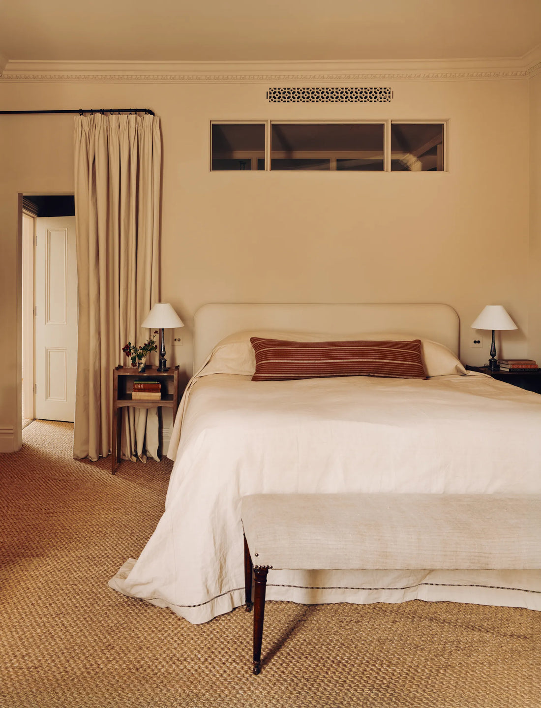
The walls, cabinetry and major surfaces are kept in warm neutrals. For example: “the hallway and kitchen walls are painted in the same colour as the kitchen cabinetry …” The main bedroom uses a very soft “Lilac Pink” from Edward Bulmer Natural Paint.
Why it works: When colours are consistent and muted, your eye isn’t constantly pulled in many directions. The space feels restful.

Hidden or restrained storage and clutter control
In the article: “a huge amount of storage has been concealed behind jib doors, as well as behind bespoke mirrors …” in the ensuite. Also: “much of the storage niftily being hidden in the depth of the wall.”
Why: Calm isn’t just about pretty things—it’s about what you don’t see (or what isn’t fighting for your attention). Concealing storage means fewer visual distractions.

Respect for original architecture + material texture
The house is a handsome 1890s red-brick Victorian with high ceilings and good proportions. Thea didn’t over-meddle with the plan: “we tried not to overthink it.” She softened contemporary additions (Crittall glazing) with weathered brick floors and reclaimed oak boards.
Why: There’s a calm confidence in letting architecture breathe and using honest materials (brick, oak)—it feels grounded, not showy or chaotic.

Soft textiles and layered fabrics
Textiles got mention: curtains in sheer linen, others in inexpensive artists’ canvas—from humble materials. The armchairs are upholstered in pale linens.
Why: Soft textures invite comfort, help mute harsh light or reflections, and provide sensory calm.

Simplicity & restraint in design decisions
Thea notes: “we were quite focused and always taking one step back to simplify a design choice.” The finished product has “just the right air of measured restraint”.
Why: Too many features, too many colours, too many materials = visual noise. Restraint means the important features (spaces, proportions, light) can shine without being shouted over.

Connection to nature & light
The kitchen extension has large glazed doors to the garden, giving an “inside-outside feel”. The main bedroom is arranged so the bed looks out over nearby Queen’s Park.
Why: Natural light, views, green outside – these boost calm. Your mind relaxes when you are connected to nature and daylight.

A witty but practical guide: How you can do “the calm house” too
Here’s your blueprint for bringing that same sense of Zen into your own home.
Step 1: Pick your whisper-tone palette
You’re not painting for the world to gasp—go for walls, big furniture and cabinetry in soft, muted tones. Think gentle greys, warm beiges, dusty pastels. Use the same colour in adjoining spaces when possible—no shouting colour jumps.
Pro tip: Keep one bold object (a cushion, artwork) as your whisper-yell, then everything else stays muted.
Note: If your room was a guest, it should whisper “ahhh” not shout “look at me!”
Step 2: Conceal the chaos
You’ve got stuff. Admit it. But you don’t need to see it all. Hidden storage is your friend. Go for built-in wardrobes, joinery with clean fronts, furniture with doors rather than open shelving for everything.
Pro tip: Even if budget doesn’t allow full joinery, use baskets/boxes in matching tones to corral things.
Note: If your storage looked younger than you, you might be showing off. Make it hide, not pose.
Step 3: Honour the bones, lean on texture
Look at your space. What is good about it? High ceiling? Big window? Original floorboards? Celebrate that. Then add in rich textures: reclaimed wood, stone, linen, canvas, sisal, brick. These give warmth and depth without being loud.
Pro tip: If you’re renovating, don’t cover over every original detail. Sometimes less is more.
Note: Your house should feel like an old friend who’s had a good life, not like a teenager with too many accessories.
Step 4: Layer calmly
Choose two or three textile tones and repeat them (e.g., linen sofa in pale grey, chair in pale linen, cushion in soft terracotta). Let fabrics do the talking in a low volume. Keep patterns minimal unless you love maximalism (but then that’s another post).
Pro tip: Use linen, artists’ canvas, or simple weaves—they don’t scream luxury, they whisper “easy-on-the-eyes”.
Note: Think of your fabrics as your house’s outfit. Are they relaxed enough to lounge in with you, or stiff and flashy?
Step 5: Less but better
Every choice: “Is this doing something meaningful?” If not—simplify. Do fewer big features rather than many small gestures. Thea’s team “always took one step back to simplify a design choice.”
Pro tip: Make a list of features you love, and another list of features people suggested that you’re lukewarm about. Cut the lukewarm ones.
Note: Your space is not a buffet of design trends—pick the dishes you’ll actually savour.
Step 6: Light + nature = instant calm
Maximise windows, garden views, green plants, daylight. Use sliding or big glass doors if you can afford them (or at least clear the view).
Pro tip: Even if you don’t have huge glazing, keep window treatments simple, avoid heavy dark drapes, and place mirrors to bounce daylight.
Note: If your house feels like a cave – even if comfy – your brain might be yawning. Let it bask in daylight.

Final thoughts
The calm of this house isn’t accidental. It’s the outcome of a thoughtful design strategy: consistent palette, hidden storage, texture over flash, respect for architecture, textile layering, and nature + light.
If you apply even three of these (“palette”, “concealed storage”, “nature/light”), you’ll be halfway to that quietly powerful calm vibe. And if you implement all six—you’ll be living in a space that doesn’t just look good, but feels good.
-Juliette