
How to Use Colour as a Neutral — Yes, It’s a Thing.
When you hear neutral, you probably think of greige sofas, white walls, and beige carpets that scream “builder basic.” But what if I told you colour can be neutral, too?
Yes — you can swap that sea of oatmeal for a rich olive green, a dusty plum, or a powdery blue and still get the calm, timeless vibe you love from classic neutrals.
Sound like witchcraft? Here’s how to do it.
1. First, Redefine What ‘Neutral’ Means
In design, a neutral isn’t about being colourless — it’s about being flexible and unobtrusive. A neutral is any hue that plays nicely with a broad palette, doesn’t dominate the room, and sets a calming backdrop for other elements to shine.
Think of a smoky navy, a soft sage, a muted terracotta. They carry depth and interest without demanding a standing ovation.

image credit: Kate Arends
2. If you're Scared, Start with Colours with Soft Undertones
To start using colour as a neutral, if you're feeling nervous, use muted, grayed-out, or earth-toned versions of your favourite shades.
Love green? Try olive, moss, or sage.
Love blue? Look for steel blue, slate, or dusty periwinkle.
Craving pink? Consider mauve, blush, or rose.
These feel timeless and pair beautifully with wood, metals, and more vivid accents.
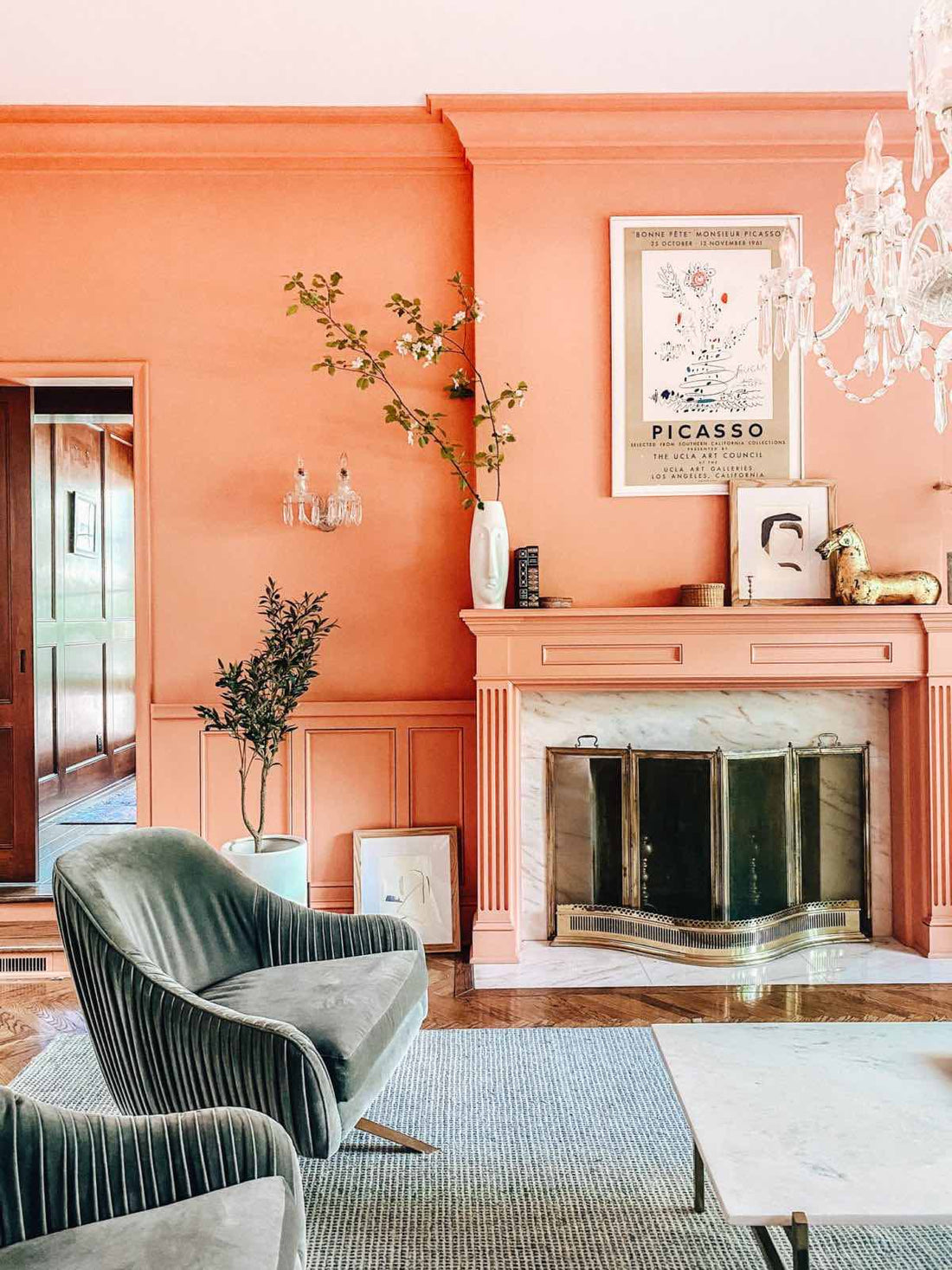
3. Use It Generously, Not Just for Accents
Here’s where most people trip: they pick a “bold” colour but only dare to use it on a throw pillow.
If you want colour to behave like a neutral, go big — paint the walls, ceiling, trim- choose a coloured sofa, pick drapes in that hue. The more you commit, the more the colour feels intentional and blends into the background.
Think about moody British libraries clad in deep green or Parisian apartments bathed in powdery blue. They feel calm, not chaotic.

image credit: Kate Arends
4. Pair It with Natural Textures and Classic Shapes
To keep coloured neutrals from feeling trendy, pair them with timeless materials: wood floors, marble, linen, wicker, brass.
When the textures are classic, your earthy plum wall or muted mustard armchair feels grounded.
5. Anchor with True Neutrals Where Needed
Balance is key. Let your coloured neutral do the heavy lifting, then sprinkle in true neutrals for clarity: crisp white trim, black metal accents, creamy textiles.
This keeps the space from tipping into rainbow territory and helps the colour read calm and chic.

Image credit: Future / Emma Lee / Sally Denning
6. Repeat the Hue in Varying Shades
A pro trick: repeat your coloured neutral in varying intensities around the room. For example, paint the walls a soft sage, throw in deeper moss velvet cushions, and add an art piece with pops of forest green.
This layering makes it feel cohesive and luxurious, not accidental.
Final Thoughts
Using colour as a neutral is how you get a space that feels warm, rich, and layered — without falling into the all-beige trap or the circus-colour pit.
So next time you reach for a white paint swatch, pause. Maybe what your space needs is a dusky blue or a gentle ochre instead.
Be brave.
- Juliette